UI design prompts: 10 ready-to-use UI prompts for Claude, ChatGPT and Gemini
UI design prompts and UI prompts you can paste as-is: 10 for web app screens, dashboards, mobile UI, design systems and UX audits in Claude Code, Cursor, ChatGPT, Gemini and Entrobase.
Prompt
Fill in the fields below and the prompt updates instantly. Copy it and use it in any AI tool.
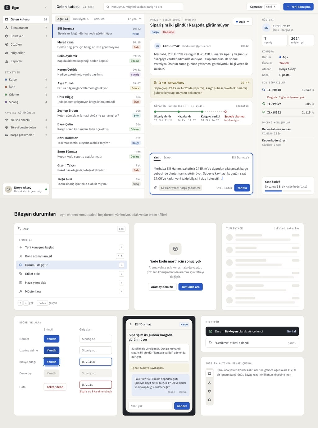
Build the interface of a web app called Ilgin as a finished product screen that does not look AI-generated.
Producta customer support inbox for small e-commerce teams.
Main screenthree-pane inbox (folders, conversation list, conversation detail).
App shell
Left sidebar: the product name as text, 6 navigation items with icon and label, count badges and a user card at the bottom; when collapsed, only the icons remain.
Top bar: page title, a search field, a command palette button (the palette also opens with Ctrl+K) and a single primary button.
Main area: the chosen main screen with realistic, consistent sample data (at least 12 records; names, dates and numbers must agree with each other).
Working parts
Clicking an item opens a detail panel on the right and clearly marks the selected item; Esc closes the panel.
The search field filters the list as you type; with no results, show an empty state with a short explanation and one button.
The Ctrl+K command palette lists 6 commands and works with the arrow keys and Enter.
Changing a status or tag updates the item instantly and shows a short toast; data stays in the browser only.
The other sidebar items open with their own title and an empty state screen.
Design
Style: calm and dense (off-white background, hairline dividers, small tight type).
Accent color #2b59c3; use it only on the primary button, the selected item and the focus ring.
Draw the component states: hover, keyboard focus, selected, disabled and skeleton rows while loading.
Spacing in multiples of 4 and 8 px; at most 5 type sizes; icons with the same stroke width; text contrast at WCAG AA.
Below 1024 px the sidebar collapses to icons; below 640 px the detail panel opens full screen.
Rules
No purple-blue gradients, glassmorphism, emoji icons or rows of three identical cards.
Short, concrete English copy; no lorem ipsum.
People, company and product names are made up; no real brands, logos or phone numbers.
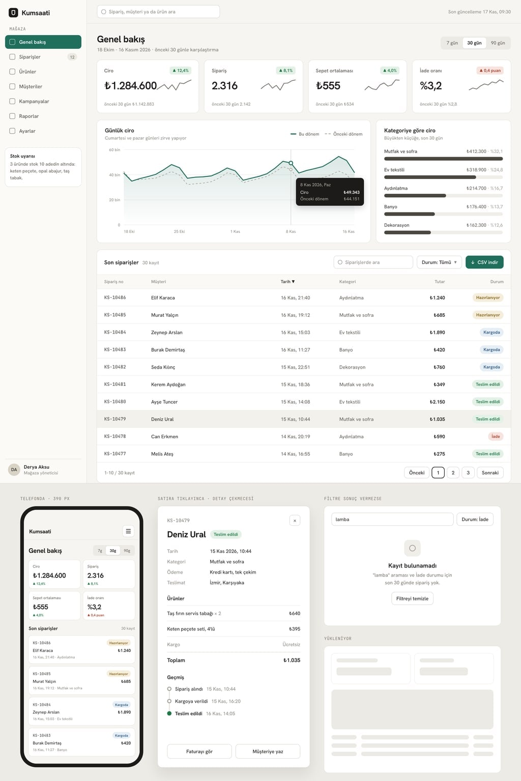
Design preview made from this prompt
9 more ready-to-use prompts
Different takes on the same topic. Copy any of them as is and replace the parts in square brackets.
1.UI prompt for Claude Code: design rules first, then screens
When to use: You are building a project in Claude Code and want every new screen to stay in the same design language.
Before writing any UI in this project, set up design rules.
- Product
- [what it does and who it is for].
- Step 1
- In CLAUDE.md at the project root, add a 'Design' section with:
- 6 color codes for background, surface, border and text; accent [color code] only on the primary action
- Two fonts (headings and body) and a 5-step type scale
- Spacing scale 4, 8, 12, 16, 24, 32 px; a single corner radius
- Banned patterns: purple-blue gradients, glassmorphism, emoji icons, rows of three identical cards
- Step 2
- Using these rules, build the [main screen, e.g. order list with a detail panel] screen with at least 12 realistic records.
- Step 3
- Run it, take a screenshot, list 5 places that break the rules and fix them.
Rules
- Also draw the empty, loading and error states.
- Put each component in its own file.
2.UI prompt for Cursor: improve an existing interface
When to use: Your app works but the UI looks generic or messy, and you want to fix the look without breaking any behavior.
Rework the UI of this project without changing what it does.
First, scan every screen and list problems under 4 headings:
- 1Inconsistent spacing and alignment
- 2Buttons, inputs and cards styled differently from screen to screen
- 3Weak visual hierarchy (places where everything looks equally important)
- 4Missing states (empty, loading, error, disabled)
Then
- Define one color, type and spacing scale; accent [color code].
- Write a single button, input, card and table component and use it on every screen.
- Change one screen at a time and summarize each change in 3 bullet points.
Rules
- Do not change data flow, routes or business logic.
- Do not add new packages.
3.UI prompt for vibe coding: design brief in the first message
When to use: You are starting a new app in an AI app builder such as Entrobase and want the first generation to already have a clear visual direction.
Build [app name], a [what it does] for [who].
Visual direction (follow it on every screen):
- Feel: [3 adjectives, e.g. calm, precise, warm]
- Background [off-white or graphite], one accent [color code] used only for primary actions
- Headings in [font], body and numbers in [font]
- Dense layout with hairline dividers instead of heavy cards
First version, only these screens:
- 1[Main screen] with at least 12 realistic records
- 2Detail panel that opens on click
- 3Create form with inline validation
Rules
- Sample data only, no login or backend yet.
- No gradients, glassmorphism or emoji icons.
- After building, list what I should ask for next, in order.
4.Gemini UI prompt: clickable prototype in Canvas
When to use: You want to see an app idea as a clickable prototype without writing code; use it with Canvas turned on in Gemini.
In Canvas, build a clickable UI prototype for [app name] as a single HTML file.
- App
- [what it does and who it is for].
Screens
- 1Main list: search, filter tabs and at least 10 realistic records
- 2Detail: a panel that opens on the right when a row is clicked, with a status change button
- 3New record: a form with validated required fields; saving puts the record at the top of the list
Design
- [light or dark] theme, accent [color code]
- Icon navigation on the left, page title at the top
- Two fonts from Google Fonts
Rules
- Data stays in the browser.
- When done, list everything that is clickable in the prototype.
5.ChatGPT UI/UX design prompt: UX audit from a screenshot
When to use: You want to know why an existing screen is not working; upload the screenshot to ChatGPT and send this prompt.
Review the interface in the screenshot I uploaded like an experienced UX designer.
- Context
- this screen is for [what it does], used by [who], and the main task is [e.g. finding an order's status].
Output
- 1The 3 things that stand out in the first 5 seconds and how they relate to the main task
- 2A usability issues table: issue, why it matters, severity (high, medium, low), suggested fix
- 3Notes on visual hierarchy, spacing, contrast and readability
- 4Accessibility: contrast, focus, tap target size
- 5If I could make only 3 changes, which ones, in order
Rules
- Comment on specific elements in the screenshot, not general advice.
- Ask as a question anything you cannot see clearly.
6.Mobile app UI design prompt: 3 screens
When to use: You want to see the core screens of a mobile app at phone size; works in Claude, ChatGPT, Gemini and Entrobase.
Design 3 mobile screens for [app name] at 390x844 and show them side by side.
- App
- [what it does and who it is for].
Screens
- 1Home: today's summary with the most important number large at the top and a list below
- 2Detail: everything about one record and a single main action button
- 3Add: a form with at most 5 fields and a save button that stays visible above the keyboard
Design
- Bottom tab bar with 3 tabs, icon and label
- Tap targets at least 44 px; main actions in the lower half within thumb reach
- Accent [color code]; light and dark versions
Rules
- All three screens show the same moment and the same data.
- Made-up but realistic content; no lorem ipsum.
7.Dashboard UI prompt: metric cards, chart and table
When to use: You need an admin or analytics interface that shows sales, inventory or usage data.
Build a dashboard UI for [company or product name]; one screen, desktop first.
- Data
- [e.g. the last 30 days of sales for an online store].
Layout
- 1Date range picker and a compare toggle at the top
- 24 metric cards: value, change versus the previous period and a small sparkline
- 3A large line chart in the center that shows the day's value on hover
- 4Top 5 products list on the right
- 5A sortable, paginated orders table with status badges at the bottom
Working parts
- Changing the date range updates the cards, chart and table together.
- Clicking a column header changes the sort order.
- Design
- [light or dark] theme, accent [color code], tabular figures for numbers.
- Rules
- every number must agree; totals match the table.
8.Design system prompt: colors, type and components
When to use: You want your product's color, type and component rules on one page before building screens.
Create a one-page design system for [product name] with live examples.
- Personality
- [3 adjectives, e.g. calm, trustworthy, fast].
Sections
- 1Color: background, surface, border, text, accent [color code], success, warning, error; each with its code and contrast ratio
- 2Type: two fonts and a 6-step scale, with where each size is used
- 3Spacing and corners: a 4 px based scale and corner radii
- 4Components: button (primary, secondary, text), input, checkbox, badge, card, table row, toast
- 5States: normal, hover, focus, disabled and error for each component, side by side
Output
- The page's HTML and CSS
- The same values as CSS variables in a separate block below
9.UI mockup image prompt for ChatGPT and Gemini
When to use: You want a single interface image for a pitch deck or portfolio, not working code.
Create a flat, realistic UI mockup image of a [app type, e.g. plant care] app.
- Subject
- a phone screen in front and the same app's desktop screen behind it, both facing the camera straight on.
- Screen content
- a large header area, a card list and a bottom tab bar; text shown as small grey lines too small to read.
- Setting
- plain [light beige] background with a short, soft shadow.
- Lighting
- soft studio light from above.
- Style
- modern product design presentation, crisp and clean.
- Palette
- [accent color], off-white, dark grey.
- Composition
- devices centered with wide empty space around them.
Aspect ratio 4:3.
What this prompt does
Most people searching for UI design prompts or UI prompts want something they can paste into Claude, ChatGPT, Gemini or a coding agent that produces a screen that looks like a shipped product, not the usual gradient and three-card layout. The main prompt describes a web app shell, a main screen, working interactions and component states; the 9 prompts below cover Claude Code, Cursor, Gemini, ChatGPT UX audits, mobile app UI, dashboards, design systems and image mockups.
Where to use it
- First screen of a SaaS product
- Admin panel or dashboard
- Mobile app UI concepts
- Starting a design system
- UX audit of an existing screen
- Clickable prototype for a demo
Fields you can fill in
The fields you can change in the form above and their default values.
- Product nameFree text
- Ilgin
- ProductFree text
- a customer support inbox for small e-commerce teams
- Main screenOne of 5 options
- three-pane inbox (folders, conversation list, conversation detail)
- StyleOne of 5 options
- calm and dense (off-white background, hairline dividers, small tight type)
- Accent colorColor
- #2b59c3
Step by step
- 1
Describe the product in two fields
Fill in Product name and Product; in Product, say what the app does and who it is for in one sentence. The sample data (conversations, tasks, metrics) is derived from that sentence.
- 2
Pick the main screen
Choose the heart of your product from Main screen: inbox, project board, analytics, weekly calendar or settings and billing. The sidebar, top bar and command palette stay the same; only the center changes.
- 3
Set the style and accent color
Style sets the background, type, corners and shadows; Accent color only drives the primary button, the selected item and the focus ring. The prompt text updates as you choose, so read the final version before copying.
- 4
Paste it into your tool
Copy it into Claude, ChatGPT or Gemini Canvas, or give it as the first request inside a project in Cursor or Claude Code. In Entrobase, the Start button sends it to Builder.
- 5
Test every state
In the result, click an item, search for a word that does not exist, press Ctrl+K and move through the screen with Tab. If the empty state, palette or focus ring is missing, ask for that part by name in the same chat.
Tips and variations
- If you have a screenshot of an interface you like, attach it and add: 'take the density and spacing rhythm from this screenshot, not the colors or content.'
- If the model keeps falling back to the same font, name two fonts in the Design lines: one for headings and one for body text and numbers.
- Dark and technical suits developer tools, warm and soft suits consumer apps, and calm and dense suits work tools that stay open for hours every day.
- Once the result is ready, ask: 'describe how this screen looks at 1440 and 390 px wide and fix anything that overflows or gets cramped.' Responsive breakpoints are often incomplete on the first pass.
Frequently asked questions
What is a UI design prompt?
It is an instruction that gets an AI tool to build an interface. A good UI design prompt names the product, the main screen, the layout, the interactions that must work, the component states and the visual direction. Asking for 'a clean modern UI' alone gives everyone the same gradient and card layout.
How do I get Claude Code to build a UI that looks good?
Give it rules instead of adjectives: background tone, two fonts, where the accent color is allowed, a spacing scale and the patterns to avoid. Putting those rules in the project's CLAUDE.md keeps every new screen in the same visual language.
Do UI prompts work in Cursor and Entrobase?
Yes. In Entrobase Builder, use the prompt as the first message of a new project; in Cursor, run it inside an existing project. For an app that already works, the improve-existing-UI prompt is safer because it changes the look without touching data flow or routes.
Can ChatGPT help with UI/UX design?
ChatGPT can write interface code, but in UI/UX work it shines at reviewing an existing screen: upload a screenshot and ask for usability issues, priorities and concrete fixes. The UX audit prompt on this page is written for exactly that.
Why do AI-generated interfaces all look the same?
With a vague request, the model falls back to the pattern it has seen most: a purple-blue gradient, a centered headline and three feature cards. Naming the patterns to avoid, choosing a real main screen and giving concrete sample data changes the result noticeably.