10 Hero Section Prompts: Examples and Guide (2026)
Hero section prompts: 10 ready-to-use prompts for the first screen of SaaS, cafe, ecommerce, app and event landing pages; works in Claude, ChatGPT, Gemini and Entrobase Builder.
Prompt
Fill in the fields below and the prompt updates instantly. Copy it and use it in any AI tool.
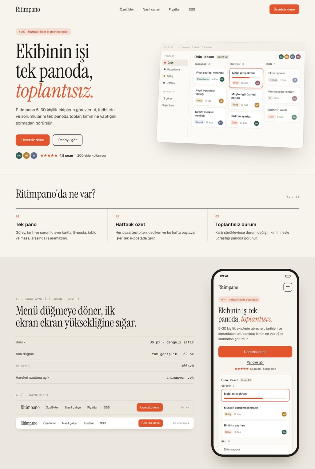
Build the first screen (hero section) of a landing page for Ritimpano; visitors should understand within 5 seconds what is offered, who it is for and what to do next.
Businessteam task tracking SaaS; visual: tilted product screenshot (task board).
Layoutsplit (text on the left, visual on the right).
Themelight (off-white background, dark text).
First screen
Top menu: brand name on the left, 4 links in the middle, primary button on the right; turns into a menu button on phones.
Eyebrow: a one-line short announcement or category.
Headline of 8 words at most that states the benefit; subheadline of 25 words at most that says who it is for and how.
Two buttons: primary action filled, secondary action outlined.
Visual: the main visual named in the Business line.
Trust line: one line of concrete proof under the buttons (rating, user count, address or date; numbers are placeholders).
Right below, a short second section: what is offered in 3 numbered points, visible on scroll.
Working parts
The first screen fits the viewport height on desktop and phone (100svh); headline, buttons and part of the visual show without scrolling.
The menu shrinks on scroll and its background turns solid; the primary button smooth-scrolls to the second section.
Eyebrow, headline, subheadline and buttons fade in one after another on load; no animation when reduced motion is on.
The main visual loads with priority through Next.js Image and has fixed dimensions so the layout does not shift.
Design
Accent color #e2552d; only on the primary button, the eyebrow and one highlighted word in the headline.
Two fonts that suit the business: a large, characterful one for the headline and a readable one for body text.
Headline at least 64 px on desktop and 36 px on phones, with balanced line breaks.
The visual is a real stock photo or product screen that fits the business; do not draw a logo.
Rules
Short, concrete English copy; no lorem ipsum.
Brand, person and review names are made up; no real brands, logos or phone numbers.
Do not use purple-blue gradients, emoji icons, floating abstract shapes or three identical cards in a row.
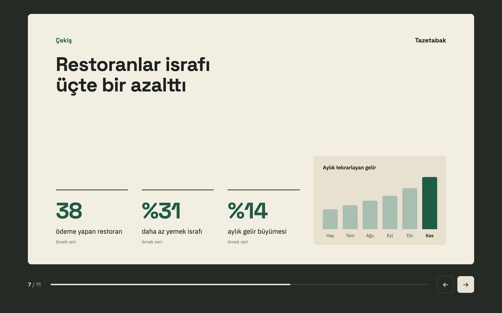
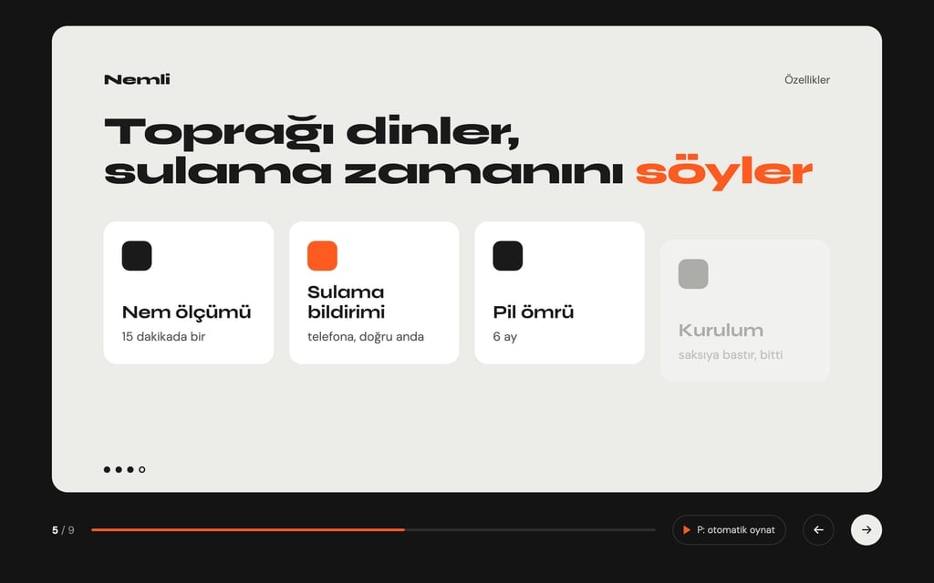
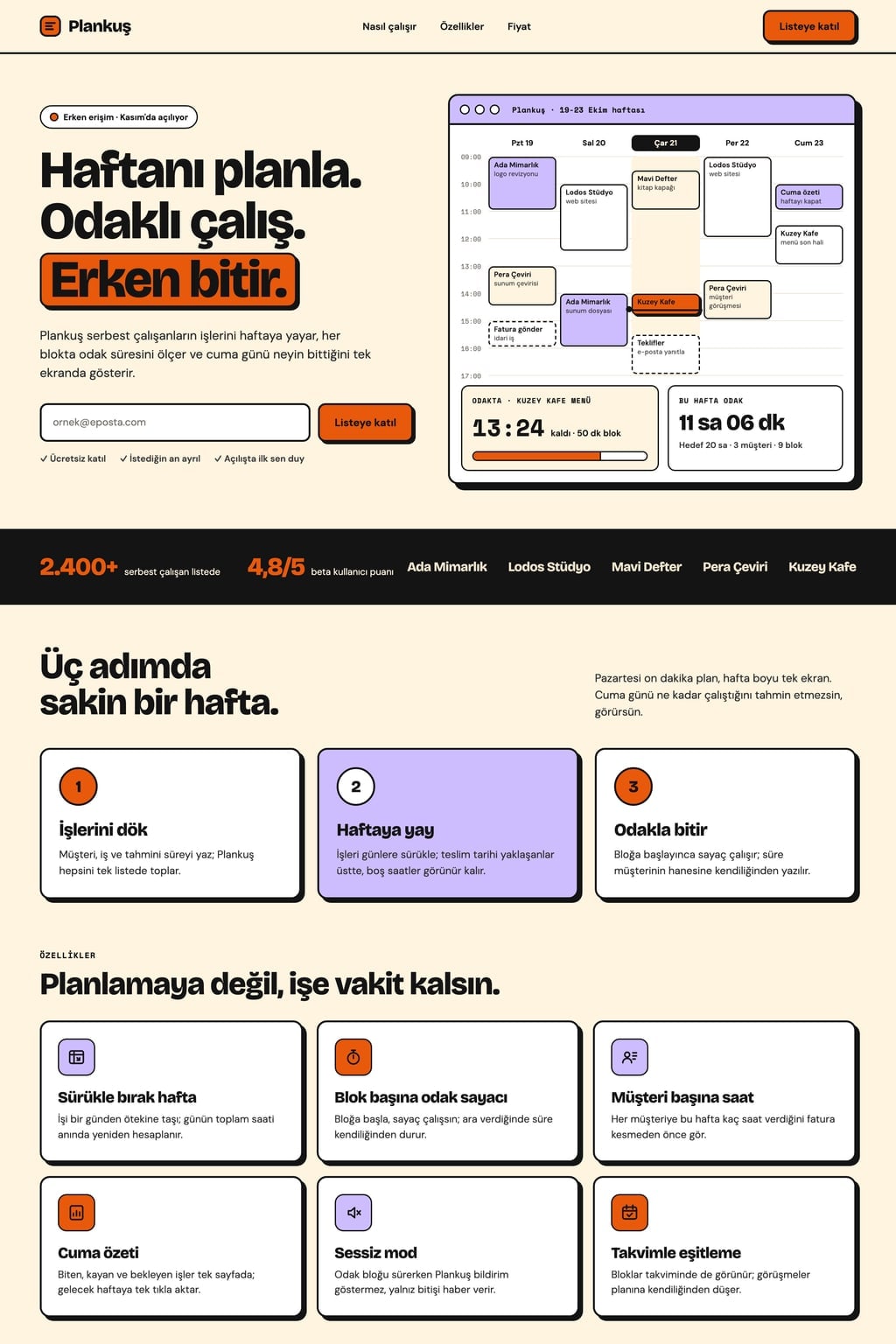
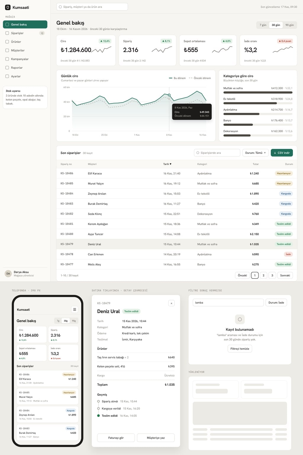
Design preview made from this prompt
9 more ready-to-use prompts
Different takes on the same topic. Copy any of them as is and replace the parts in square brackets.
1.Hero section prompt for Claude: single HTML file artifact
When to use: Use it when you want a one-file first screen you can see right next to the chat in Claude and refine by talking.
Write a landing page first screen (hero section) that runs in a single HTML file and show it as an artifact.
- Brand
- [brand name]
- What it offers
- [product or service, one sentence]
- For whom
- [audience]
Parts
- 1Top menu: brand, 4 links, primary button on the right
- 2Headline of 8 words at most, subheadline of 25 words at most
- 3Two buttons: [primary action] filled, [secondary action] outlined
- 4Visual area on the right: for now a colored placeholder that keeps its ratio, with a note on which image goes there
- 5One line of trust information under the buttons
Design
- [light or dark] background, accent color [hex code]; a characterful headline font and a readable body font
- At phone width, text on top and visual below
Rules
- No external libraries; CSS and JavaScript in the same file.
- When done, suggest 3 alternative headlines.
2.Tailwind hero section component for React and Next.js
When to use: Use it when you need a single-file hero component written with Tailwind classes for a Next.js or React project.
Write a single React component with Tailwind CSS: Hero.tsx.
- Project
- [Next.js or Vite], TypeScript.
Content comes in through props: eyebrow, title, subtitle, primaryCta, secondaryCta, image, stats.
Layout
- Two columns on desktop (text left, visual right), one column below lg
- Headline text-5xl md:text-7xl with balanced lines (text-balance)
- Visual aspect-[4/3], rounded-2xl, fixed width and height
Behavior
- With motion-safe, headline and buttons fade in one after another; no animation with motion-reduce
- Buttons show a visible focus ring when focused with the keyboard
Output
- 1The Hero.tsx code
- 2Example props filled in for [brand name]
- 3Which classes to change to recolor it, in 3 bullet points
3.Hero section in plain HTML and CSS (no framework)
When to use: Use it when you want copy-paste HTML and CSS you can drop into an existing site without any framework.
Write HTML and CSS for a hero section without any framework or library.
- Brand
- [brand name]
- Headline
- [headline]
- Subheadline
- [subheadline]
- Buttons
- [primary action], [secondary action]
- Background
- [image URL], full width, with a dark overlay that keeps the text readable
Rules
- min-height: 100svh; content sits bottom-left
- Fluid headline with clamp(): 36 px on phones, 72 px on desktop
- CSS variables --accent, --bg, --text so colors change in one place
- Semantic tags: header, nav, section, h1; alt text on the image
- Below 768 px, buttons stack and go full width
- Output
- HTML first, then CSS, in separate code blocks; finish with 3 steps to add it to a site.
4.3D hero section prompt with Three.js
When to use: Use it when you want one 3D object on the first screen that turns gently with the mouse and still runs smoothly on phones.
Build a 3D hero section with Three.js.
- Brand
- [brand name]
- What it offers
- [one sentence]
Scene
- A single object on the right: [object, e.g. glass cube, ceramic vase, crystal]
- Soft studio lighting, a plain background that matches the page color
- The object turns up to 15 degrees with the mouse and slowly moves away on scroll
Text layer
- Headline (8 words at most), subheadline and two buttons on the left; text in HTML above the canvas
Performance
- Pixel ratio capped at 2; stop rendering when the scene is off screen
- On phones and with reduced motion on, show a still image of the same object instead of 3D
- Output
- a single HTML file loading Three.js from a CDN; explain where to change the object and the colors.
5.Hero section animation prompt: rotating word and parallax
When to use: Use it when you want a moving first screen: a word that changes in the headline, a staggered entrance and depth on scroll.
Write an animated hero section; motion should help tell the story, not distract.
- Brand
- [brand name]
- Headline pattern
- [fixed part] + [rotating word]
- Rotating words
- [word 1], [word 2], [word 3]
Animations
- 1The rotating word slides up and swaps every 2.5 seconds; the line width does not jump
- 2On load, eyebrow, headline, subheadline and buttons appear 80 ms apart
- 3On scroll, the background image moves slower than the text (subtle parallax)
Rules
- Animate only transform and opacity; nothing that shifts the layout
- With prefers-reduced-motion on, the rotation stops and the first word stays
- Screen readers read the headline as one sentence
- Output
- [HTML, CSS and JavaScript or React and Tailwind] code and a short note on changing the timings.
6.Hero section copy prompt: headline, subheadline and CTA
When to use: Use it when the design is done and you only need ChatGPT or Claude to write the headline, subheadline and button text.
Write the copy for the first screen (hero section) of my landing page.
- Product or service
- [what it offers]
- For whom
- [audience]
- Biggest benefit
- [what the customer gains]
- Proof
- [a real fact such as rating, customer count or time saved]
Output
- 15 headlines, 8 words at most, each from a different angle (benefit, problem, outcome, speed, identity)
- 2A matching subheadline for each, 25 words at most, saying who it is for and how
- 33 primary button labels (2-4 words, starting with a verb) and 3 secondary button labels
- 4One trust line to sit under the buttons
- 5The strongest pairing and why, in 2 sentences
Rules
- Be concrete; avoid empty words like "innovative", "revolutionary" or "all-in-one".
- Do not invent numbers that are not in the proof.
7.Hero image prompt for ChatGPT and Gemini
When to use: Use it when you want ChatGPT, Gemini or Entrobase Canvas to generate the wide image behind or beside your first screen.
Generate a wide image for the first screen of a website.
- Subject
- [product, place or scene; e.g. an empty coffee counter in morning light]
- Composition
- subject in the right third; the left half plain and calm for a headline added later
- Light
- [e.g. soft window light from the left]
- Camera
- eye level, 35 mm, shallow depth of field, subject sharp
- Style
- realistic editorial photography
- Palette
- [2-3 colors] that match the site's accent color
All surfaces plain and unbranded; any people seen from a distance and from behind.
Aspect ratio 16:9. If you need a 4:5 version for phones, ask for the same scene at 4:5 in a separate request after this image.
8.Mobile-first hero section prompt
When to use: Use it when most visitors come from phones and the first screen must look right at 390 px before anything else.
Build a hero section designed for phones first, then expand it to desktop.
- Brand
- [brand name]
- What it offers
- [one sentence]
Phone (390 px)
- 1Brand and menu button on top, 56 px tall
- 2Headline 34-38 px, 3 lines at most; subheadline 16 px, 3 lines at most
- 3Full-width primary button at least 48 px tall; secondary action as a text link below
- 4Visual under the text at 4:5; the first screen is 100svh tall, with headline, subheadline, primary button and the top of the visual visible without scrolling
Desktop (1280 px and up):
- Text left, visual right; 64 px headline
Rules
- Tap targets at least 44 px; no horizontal scrolling
- The first screen does not jump when the address bar shows or hides (svh units)
- Output
- [HTML and CSS or React and Tailwind] code.
9.Hero section design spec to rebuild in Figma
When to use: Use it when you want a precise layout spec (grid, spacing, type sizes, states) that a designer can rebuild as a Figma frame.
Write a design spec for a landing page hero section that I will rebuild in Figma.
- Brand
- [brand name]
- What it offers
- [one sentence]
- Style
- [e.g. editorial light, dark SaaS, warm cafe]
Spec
- 1Frames: desktop 1440 x 900 and mobile 390 x 844
- 2Grid: columns, gutter and margins for each frame
- 3Elements in order with exact sizes: menu, eyebrow, headline, subheadline, buttons, visual, trust line
- 4Type scale: font pairing, sizes, line heights and weights
- 5Colors: background, text, accent and button states (default, hover, focus) as hex codes
- 6Spacing tokens between elements, in an 8 px scale
- Output
- a table per frame plus a short note on what changes between desktop and mobile; include the final headline and button text.
What this prompt does
Most people searching for hero section prompts want text they can paste into an AI tool to get a complete first screen: headline, subheadline, two buttons, a main visual and a trust line, fitted to the viewport. The main prompt lets you pick the business, layout and theme; the 9 prompts below cover a Claude artifact, a Tailwind and React component, plain HTML and CSS, 3D, animation, hero copy, a hero image, a mobile-first layout and a design spec to rebuild in Figma.
Where to use it
- SaaS product landing page
- Cafe and restaurant homepage
- Ecommerce collection launch
- Mobile app landing page
- Event and conference page
- Agency and studio homepage
Fields you can fill in
The fields you can change in the form above and their default values.
- Brand nameFree text
- Ritimpano
- BusinessOne of 6 options
- team task tracking SaaS; visual: tilted product screenshot (task board)
- LayoutOne of 5 options
- split (text on the left, visual on the right)
- ThemeOne of 3 options
- light (off-white background, dark text)
- Accent colorColor
- #e2552d
Step by step
- 1
Pick the business and layout
Type your brand name and pick your business; the choice also sets the main visual: a tilted product screen for SaaS, breakfast on a table for a cafe, stage, date and countdown for an event. Then pick a split, centered, full-bleed, type-led or bento layout.
- 2
Set the theme and accent color
Theme sets the background and text colors; Accent color is used only on the primary button, the eyebrow and one highlighted word in the headline. The text updates as you choose, so read the final version before copying.
- 3
Paste it into your tool
Copy it; in Claude, paste it into the chat and the first screen opens as an artifact beside it. In Gemini, choose Canvas and paste. In ChatGPT, ask for a single HTML file. In Entrobase, the Start button sends the text to Builder.
- 4
Check what shows without scrolling
Open the page on desktop and at phone width: the headline, both buttons and part of the visual should be visible without scrolling. In Nielsen Norman Group's eye-tracking study, users spent about 57% of their page-viewing time above the fold.
- 5
Replace the placeholder facts
The rating, user count and reviewer name in the first version are placeholders. Give the chat your real facts and ask it to update the trust line; if you have no numbers, use something concrete such as your address, opening date or delivery time.
Tips and variations
- Keep the headline to 8 words and state the benefit: 'Your team's work on one board, no meetings' says far more than 'An innovative work management platform'.
- The main visual is often the largest element on the page and sets Largest Contentful Paint; web.dev puts a good LCP at 2.5 seconds or less. Compress the image, give it fixed dimensions and load it with priority.
- A split layout suits SaaS and app launches, a full-bleed photo suits cafes, hotels and events, and a type-led layout feels most natural for agencies and studios.
- Choose one primary action; two equally loud buttons leave visitors undecided. Keep the second one outlined or turn it into a text link.
- With a background photo, place the headline over the plain part of the image and add a dark overlay; the hero image prompt below leaves that empty space from the start.
Frequently asked questions
What is a hero section?
It is the first section visitors see when a web page loads, before scrolling. It usually holds a headline, a subheadline, one or two call-to-action buttons and a main visual, and it is often where visitors decide whether to stay.
What should a hero section include?
A short headline that states the benefit, a subheadline that says who it is for, one clear primary button, a visual that fits the business and a concrete trust signal near the buttons (rating, customer count, address). The main prompt on this page asks for these parts in order and limits the menu to 4 links.
How do I write a Tailwind hero section prompt?
Name the component, list its props, say at which breakpoint the two columns stack, give the headline size and spell out motion-safe and motion-reduce behavior. The Tailwind and React prompt on this page asks for a single-file Hero.tsx component that takes its content through props.
Can AI build a 3D hero section?
Yes. The Three.js prompt on this page asks for a single object that turns up to 15 degrees with the mouse and keeps the text as HTML above the canvas. On phones and with reduced motion on, a still image of the same object is shown so the page stays fast.
What aspect ratio should a hero image be?
For an image beside the text, 4:3 or 1:1 works well; for a full-width background, 16:9. On phones, use a 4:5 crop of the same scene. When generating the image, keep the side where the headline goes plain and uncluttered.