9 App Icon Prompts (ChatGPT): Examples and Guide (2026)
9 app icon prompts for ChatGPT and Gemini: iOS and Android app icons, an icon refresh, a consistent icon set and a game icon; works in Entrobase Canvas too.
Tested: EntroGen Flash, November 2026
Prompt
Fill in the fields below and the prompt updates instantly. Copy it and use it in any AI tool.
Design a wordless app icon for a mobile app.
Appa habit and daily goal tracking app.
Symbola check mark merged with a rising arc; one bold, simple shape in the middle of the icon.
Forma square icon tile with softly rounded corners; the symbol fills about 60 percent of the tile.
Stylesoft 3D, the symbol slightly volumetric and glossy.
Colorthe tile background a subtle vertical gradient in shades of #5b5bd6, the symbol white; three colors at most.
Lightsoft light from above, a very light shadow under the tile.
Anglestraight-on, flat.
Compositionthe icon tile centered; a plain light gray background with wide space around it.
Textno letters, words or numbers in the image.
Aspect ratio 11.
Image made with this prompt
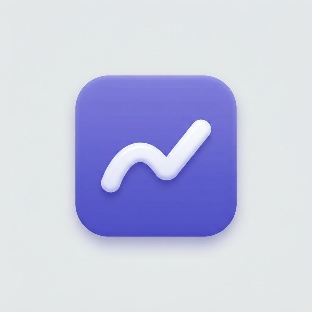
8 more ready-to-use prompts
Different takes on the same topic. Copy any of them as is and replace the parts in square brackets.
1.ChatGPT app icon prompt
When to use: When you want a modern, wordless icon for your app from scratch in ChatGPT.
Design an icon for a mobile app.
- App
- [e.g. a plant watering reminder].
- Symbol
- [e.g. a leaf with a water drop], single and bold.
- Form
- rounded square tile.
- Style
- soft 3D, slightly glossy.
- Color
- [e.g. green] tile, white symbol.
- Text
- no text in the image.
- Ratio
- 1:1
2.iOS app icon prompt for the App Store
When to use: When you need a full-square icon for the App Store and the system will round the corners.
Design a full-square app icon for the App Store.
- App
- [e.g. a meditation and breathing app].
- Symbol
- [e.g. two nested half circles], centered.
Rules
- The whole image is the icon; square corners, no margin.
- The symbol sits in the middle and does not touch the edges.
- No text.
- Color
- [e.g. navy to purple gradient], white symbol.
- Ratio
- 1:1
3.Android adaptive icon layers
When to use: When your Android app needs the foreground symbol and background color as separate layers.
Show the two layers of an Android adaptive icon side by side.
- Left
- only the foreground symbol [e.g. a white compass needle] on a plain light gray background.
- Right
- only the background, a plain [e.g. orange] square.
Rules
- The symbol sits in the central safe zone, away from the edges.
- No text.
- Ratio
- 16:9
4.Gemini app icon redesign
When to use: When your app icon looks dated and you want a current version that keeps the same idea.
Refresh the app icon I uploaded.
- Keep
- the main symbol and the main color.
Change
- Reduce detail and make the symbol bolder.
- Add a subtle gradient to the tile and a soft 3D look to the symbol.
- Form
- rounded square tile.
- Text
- none.
- Ratio
- 1:1
5.Consistent app icon set (4 icons)
When to use: When the main icon, widgets and shortcuts should share one style.
Design 4 app icons in the same style and show them in a 2x2 grid.
- Subjects
- [e.g. calendar, notes, goals, stats].
Rules
- All rounded square tiles with the same corner radius.
- One color family: [e.g. teal shades], white symbols.
- Same stroke weight, no text.
- Background
- plain light gray.
- Ratio
- 1:1
6.Mobile game app icon
When to use: When your mobile game needs a lively icon built around a character or object.
Design an app icon for a mobile game.
- Character
- [e.g. a cute hedgehog wearing a helmet], face and shoulders fit the tile.
- Style
- bright, colorful 3D cartoon.
- Background
- [e.g. sky blue] tile with a light glow.
- Text
- no text in the image.
- Ratio
- 1:1
7.Glass app icon prompt
When to use: When you want a layered, translucent icon with a current look.
Design an app icon made of frosted glass layers.
- Symbol
- [e.g. two overlapping chat bubbles].
- Material
- translucent frosted glass with bright edges.
- Background
- [e.g. blue to pink gradient] tile.
- Text
- none.
- Ratio
- 1:1
8.Web app (PWA) and favicon icon
When to use: When the same icon must work in a browser tab and on the home screen.
Design an icon that works as both a favicon and a home screen icon for a web app.
- Symbol
- [e.g. a lightning bolt].
Rules
- Very simple, one-color symbol with a bold stroke.
- Little enough detail to read at 16 pixels.
- No text.
- Color
- [e.g. yellow] tile, black symbol.
- Ratio
- 1:1
What this prompt does
Need an app icon prompt for ChatGPT or Gemini? Copy one of the 8 variants below: app icons for ChatGPT and Gemini, a full-square App Store icon, Android adaptive icon layers, an icon refresh and a consistent icon set. The main prompt above creates a wordless, single-symbol icon on a rounded square tile.
Where to use it
- App Store and Google Play icon
- Web app (PWA) icon
- App splash screen
- App image on a landing page
- Product icon in a pitch deck
Fields you can fill in
The fields you can change in the form above and their default values.
- AppFree text
- a habit and daily goal tracking app
- SymbolFree text
- a check mark merged with a rising arc
- StyleOne of 4 options
- soft 3D, the symbol slightly volumetric and glossy
- Main colorColor
- #5b5bd6
Step by step
- 1
Describe the app and the symbol
Write what the app does in the App field and one shape in the Symbol field (for example a check mark merged with a rising arc). Icons are small on a phone; one bold symbol reads better than two small ones.
- 2
Pick a style
Soft 3D is the common look on phone screens today, flat vector is clean and quick to recognize, frosted glass feels layered, and a line glyph suits utility apps.
- 3
Generate at 1:1 in Canvas and check it at home screen size
Open Canvas with Use Prompt, generate a square and shrink it to 60 pixels. If the symbol still reads, the icon works on the home screen.
- 4
Prepare the store file
Apple's Human Interface Guidelines say the App Store icon is uploaded as a 1024x1024 pixel square and the system rounds the corners. Crop only the tile as a square and leave the gray background out of the file.
Tips and variations
- Pick a tile color that differs from competing apps: people find an icon by color first and symbol second.
- Skip thin lines and small details in the symbol; thin strokes vanish in a 60-pixel icon.
- Google Play's icon design specifications ask for a 512x512 pixel store icon; you can scale down the same square image.
- If the app needs several icons (settings, widgets), use the icon set variant to generate them all in one style at once.
Frequently asked questions
How do I write an app icon prompt for ChatGPT?
Put what the app does, one symbol, the tile shape, the style, up to three colors and the 1:1 ratio on separate lines. Say clearly that the image has no text; the system shows the app name under the icon.
Can Gemini make an app icon?
Yes. Paste the Gemini variant from this page into Gemini and describe the app and the symbol. If you have an old icon, upload it and use the refresh variant.
What size should an iOS app icon be?
Apple's Human Interface Guidelines say the App Store icon is supplied as a 1024x1024 pixel square; the system applies the corner rounding, so the file keeps square corners.
What does an Android app icon need?
The Google Play store icon is 512x512 pixels. For the app's own icon, Android uses separate foreground (symbol) and background (color) layers; the Android variant creates both separately.
Is there a free app icon prompt generator?
Copying the prompts on this page is free, and they work in the free versions of Gemini and ChatGPT. Generation limits depend on each tool's own plan.